Company:
Deliverable:
Role:
Timeframe:
3 Months
Industry/Category:
Fintech, Cybersecurity, Web3, B2B
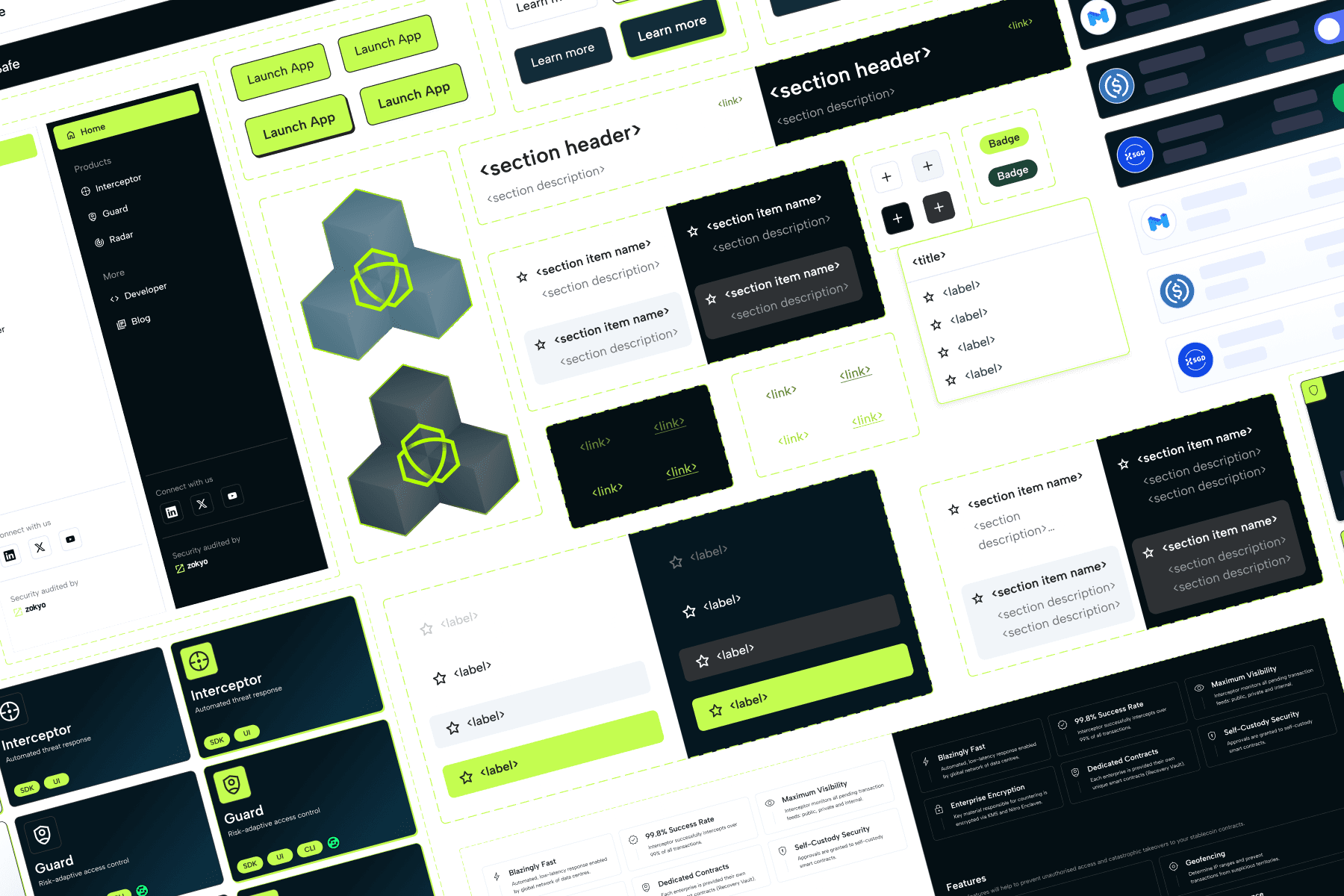
Designing a centralised dashboard to bring FailSafe's security tools together in one sleek, unified platform - think Adobe Suite, but for Web3 cybersecurity.
Light/dark modes, dev docs, consistent UX, and fully on-brand design.
Gave BD a solid demo asset, helped land new clients, improved cross-sell, and got internal teams aligned on how current (and future) products should look, feel, and function—plus the bonus of tighter collaboration and faster design/dev turnaround.
Works with Figma
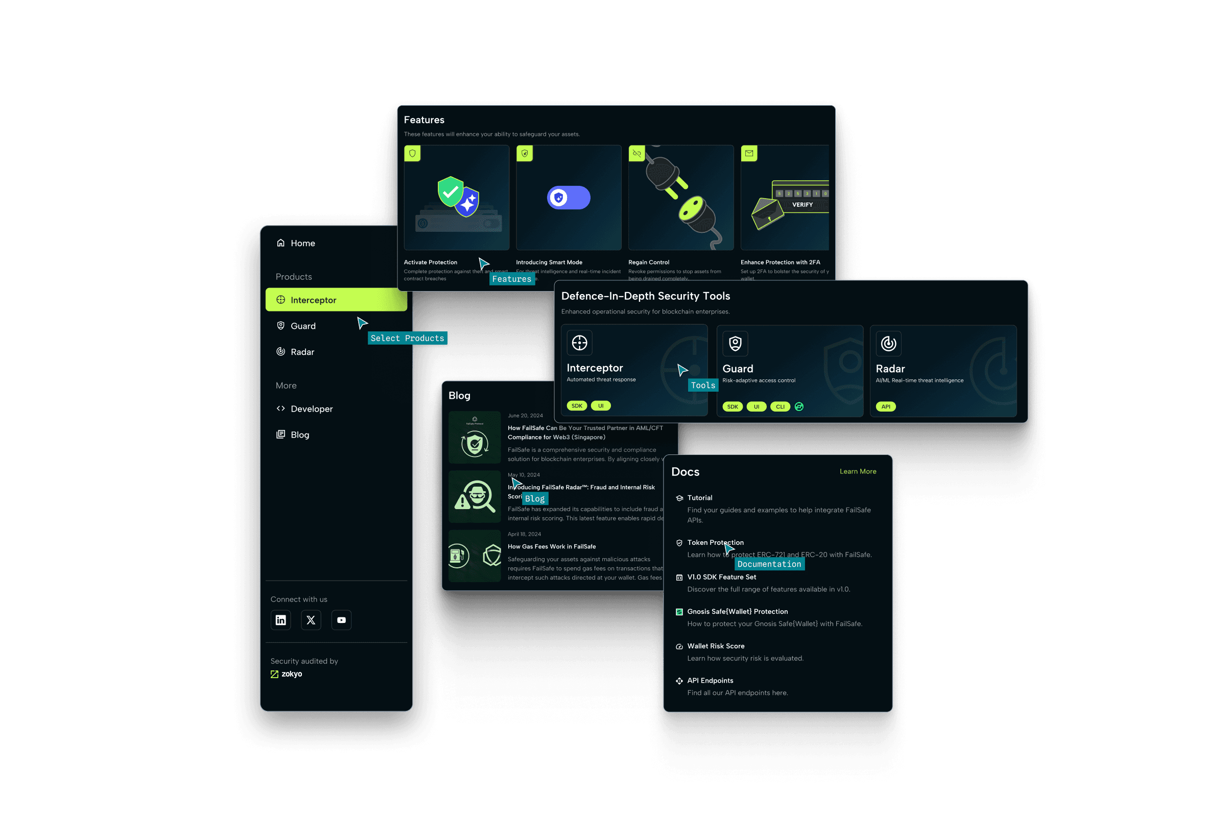


Often, when creating a product, we focus on its primary function. A dashboard? Sure, it’s meant to provide quick access, a clean overview, and streamline navigation. But sometimes, it can do more.
In FailSafe’s case, the dashboard became the narrative spine of the entire company. It told a unified story that each FailSafe product was a part of a powerful, interlinked ecosystem, and that FailSafe was committed to not just security but also user experience.
It gave BD a conversation starter. It gave clients clarity and confidence. It also gave internal teams a common direction, a shared vision, making future builds smoother and faster.
Key takeaways? Web3 clients desire seamless integration and clear, technical explanations. And yes — dark mode matters.